
Home Light Mapping
Master the art of mapping natural light to optimize your living space
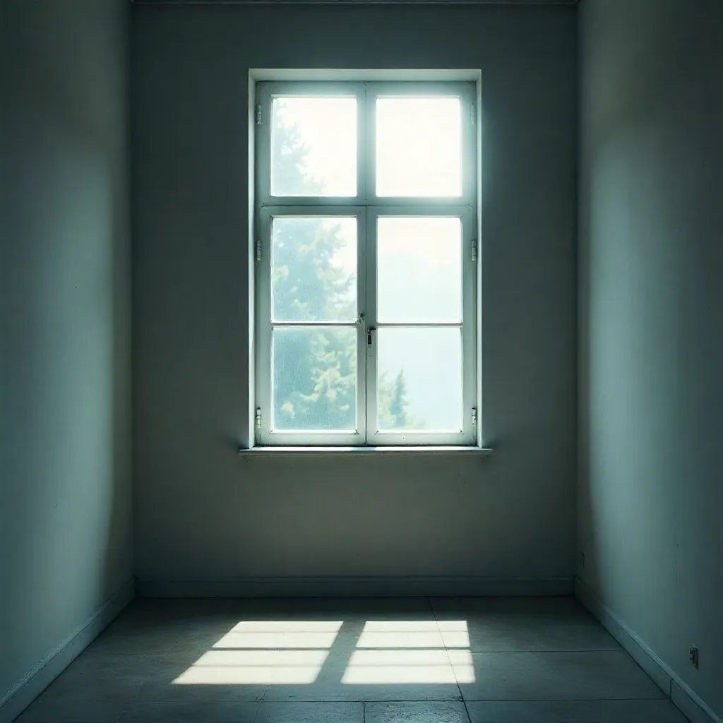
Understanding Light Zones
Every room has distinct light zones based on window placement, time of day, and seasonal changes. Identifying these zones is the first step to optimal space planning.
Bright Zone
Location: Directly adjacent to windows, especially south and west-facing
Characteristics:
- High light intensity (500-2000+ lux)
- Direct sunlight for several hours daily
- May experience glare and heat gain
- Best for: Plants, reading nooks, morning routines
Furniture Tips: Use light-colored, heat-resistant materials. Consider adjustable window treatments.
Medium Zone
Location: 3-6 feet from windows, receiving indirect or filtered light
Characteristics:
- Moderate light intensity (200-500 lux)
- Even, diffused illumination
- Minimal glare and shadow
- Best for: Work areas, dining spaces, general activities
Furniture Tips: Ideal for most furniture placement. Versatile zone for various activities.
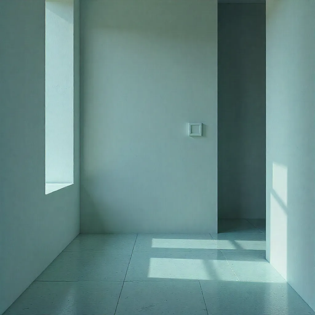
Low Zone
Location: Far from windows, corners, and interior areas
Characteristics:
- Low light intensity (50-200 lux)
- Relies on reflected and ambient light
- Consistent, shadow-free illumination
- Best for: Storage, display areas, evening relaxation
Furniture Tips: Use light-colored furniture and walls to maximize reflection. Add task lighting as needed.
Variable Zone
Location: Areas that transition between zones throughout the day
Characteristics:
- Changing light intensity (100-1000+ lux)
- Shifting shadows and highlights
- Dynamic throughout day and seasons
- Best for: Flexible spaces, multi-purpose areas
Furniture Tips: Use adaptable furniture arrangements. Consider mobile pieces that can be repositioned.
Planning Furniture Placement Based on Brightness
Strategic furniture placement maximizes natural light benefits while minimizing glare and shadow issues.

Key Principles
1. Work Surfaces: Position desks and work tables perpendicular to windows to avoid direct glare while maximizing natural light. North-facing windows provide the most consistent, shadow-free light for detailed work.
2. Seating Areas: Place sofas and chairs to face windows or at angles that allow natural light to illuminate faces without causing squinting. This creates a welcoming, well-lit social space.
3. Storage Solutions: Position tall furniture (bookcases, cabinets) along walls opposite windows to avoid blocking light. Use low-profile storage in bright zones.
4. Dining Areas: Center dining tables in medium zones with windows providing ambient side lighting. Avoid placing directly in front of windows to prevent glare during meals.
5. Bed Placement: For bedrooms, consider placing beds to receive morning light (east-facing) for natural wake-up cues, or away from windows if you prefer darker sleeping conditions.
Understanding Reflection Behavior of Surfaces
Different surfaces reflect light differently, affecting both the brightness and quality of light in your space.
High Reflectivity (80-95%)
Surfaces: White walls, mirrors, glossy white finishes, polished marble
Effect: Maximizes light distribution, creates bright, airy spaces. Can cause glare if not properly diffused.
Best Use: Low-light areas, small spaces, areas needing maximum brightness
Medium Reflectivity (40-60%)
Surfaces: Light-colored walls, matte finishes, light wood, beige tones
Effect: Balanced light distribution with comfortable brightness. Reduces glare while maintaining illumination.
Best Use: General living areas, work spaces, versatile rooms
Low Reflectivity (10-30%)
Surfaces: Dark walls, dark wood, textured surfaces, dark fabrics
Effect: Absorbs light, creates intimate, cozy atmospheres. May require additional lighting.
Best Use: Accent walls, evening spaces, areas where warmth is desired
Light Reflection Chart
| Surface Type | Reflectivity % | Light Effect |
|---|---|---|
| White matte wall | 85-90% | Maximum brightness |
| Light beige wall | 50-60% | Balanced illumination |
| Medium gray wall | 30-40% | Moderate brightness |
| Dark wall | 10-15% | Absorbs light |
| Mirror | 90-95% | Reflects and redirects light |
Choosing Wall Colors Based on Light Direction
The direction your windows face determines the quality and intensity of light, which should guide your color choices.
North-Facing Rooms
Light Quality: Cool, consistent, indirect light throughout the day. Minimal direct sunlight.
Recommended Colors:
- Warm whites and creams to add warmth
- Light warm grays and beiges
- Soft pastels with warm undertones
- Avoid: Cool blues and grays (can feel cold)
Why: North-facing light is naturally cool, so warm colors balance the temperature and create comfort.
South-Facing Rooms
Light Quality: Bright, warm, direct sunlight for most of the day. High light intensity.
Recommended Colors:
- Cool whites and light grays to balance warmth
- Soft blues and greens for calm
- Medium tones that won't feel washed out
- Avoid: Very warm colors (can feel overwhelming)
Why: South-facing rooms receive abundant warm light, so cooler colors prevent the space from feeling too hot.
East-Facing Rooms
Light Quality: Bright, warm morning light that transitions to cooler, indirect light in afternoon.
Recommended Colors:
- Versatile neutrals that work in both warm and cool light
- Light to medium tones
- Colors with balanced warm/cool undertones
- Consider: Colors that enhance morning energy
Why: The changing light quality requires colors that look good in both warm morning and cooler afternoon light.
West-Facing Rooms

Light Quality: Cool morning light transitioning to warm, intense afternoon and evening sunlight.
Recommended Colors:
- Cool to neutral tones to balance afternoon warmth
- Light blues, greens, or grays
- Colors that remain calm in intense light
- Avoid: Very warm colors (intensified by afternoon sun)
Why: Afternoon sun can be intense and warm, so cooler colors maintain balance and prevent overheating.
Room-Specific Light Mapping Guides
Each room type has unique lighting needs. Here's how to map and optimize light for different spaces.
Living Room
Primary Goals: Comfort, versatility, social interaction
Light Mapping Strategy:
- Create multiple light zones for different activities
- Use medium zones for main seating areas
- Place reading lamps in bright zones
- Use low zones for display and storage
Color Recommendations: Warm neutrals, soft beiges, light warm grays
Home Office
Primary Goals: Focus, productivity, reduced eye strain
Light Mapping Strategy:
- Position desk perpendicular to windows
- Use north or east-facing windows for consistent light
- Avoid direct glare on computer screens
- Combine natural light with task lighting
Color Recommendations: Cool whites, light blues, soft greens
Bedroom
Primary Goals: Rest, relaxation, circadian rhythm support
Light Mapping Strategy:
- Maximize morning light for natural wake-up
- Use blackout options for evening
- Create soft, diffused lighting zones
- Minimize harsh shadows
Color Recommendations: Warm pastels, soft lavenders, warm whites
Kitchen
Primary Goals: Functionality, safety, visual clarity
Light Mapping Strategy:
- Ensure bright zones over work surfaces
- Use medium zones for dining areas
- Maximize natural light for food preparation
- Combine with task lighting under cabinets
Color Recommendations: Clean whites, light warm grays, soft yellows
Start Mapping Your Space
Use these principles to analyze your own space. Observe light patterns throughout the day and adjust your furniture and color choices accordingly.
Get Personalized Guidance